Solrig Wellness
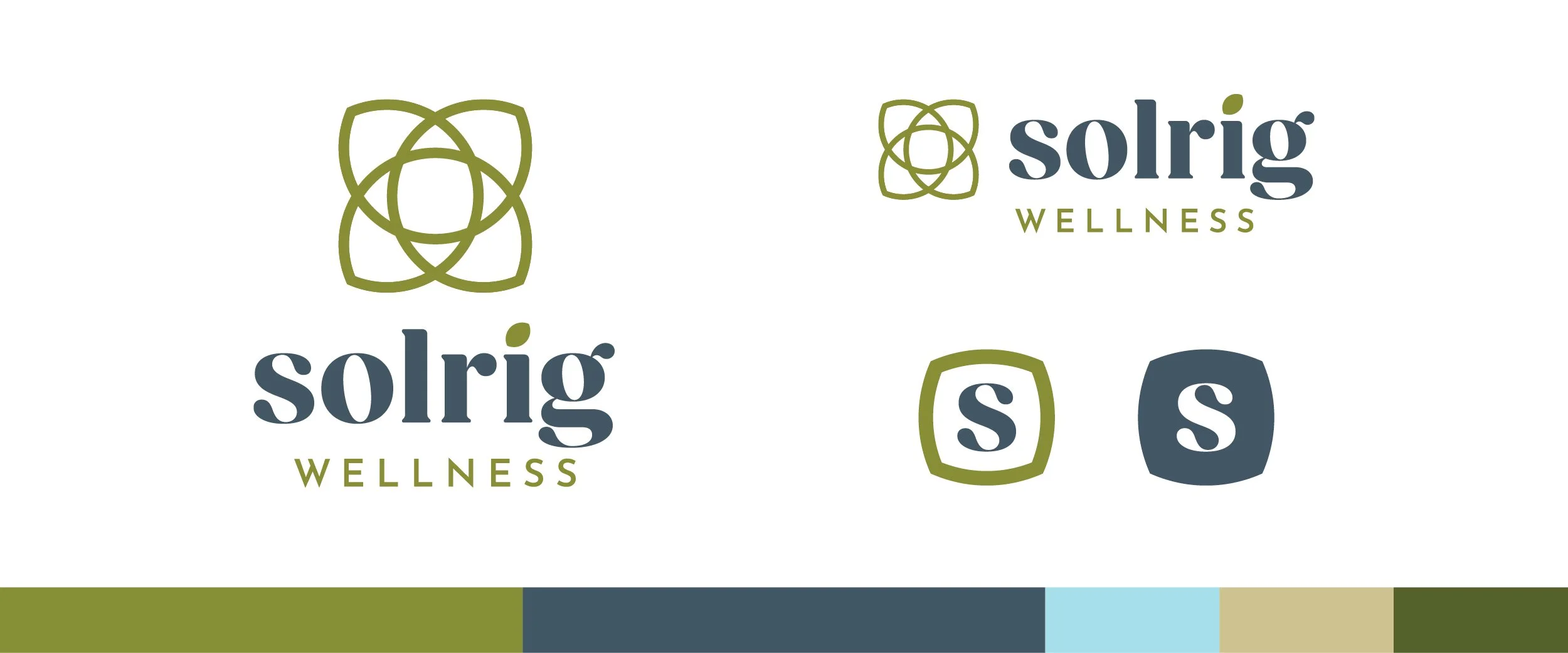
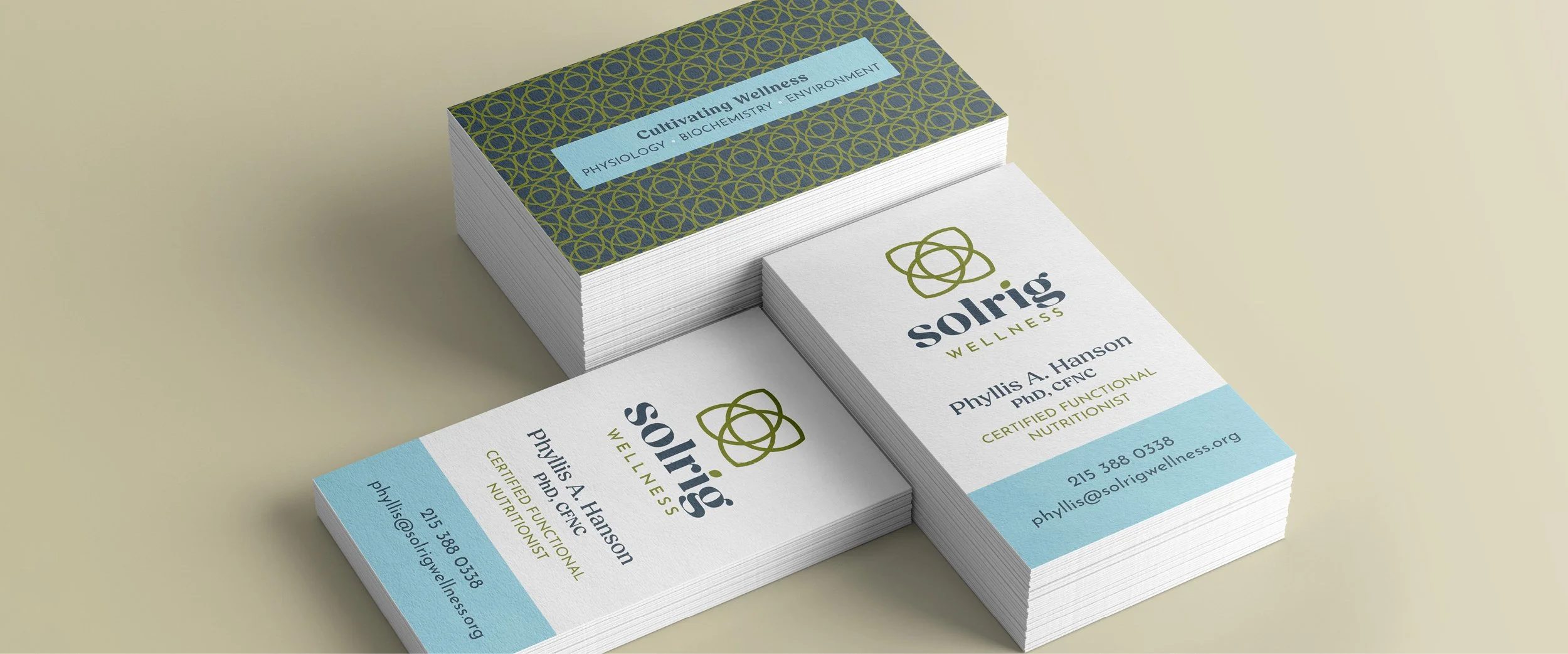
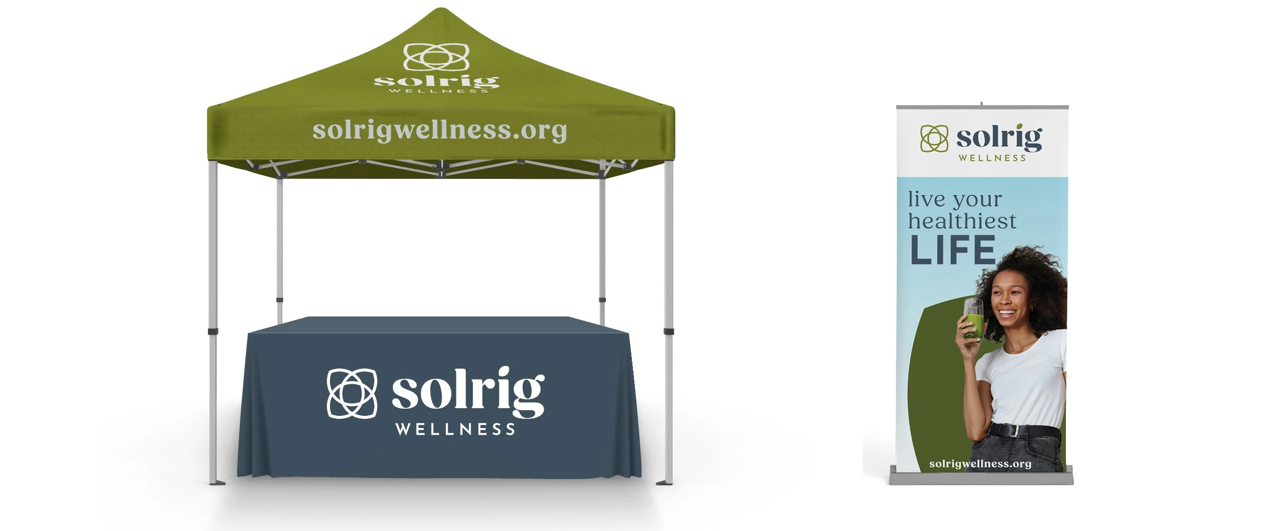
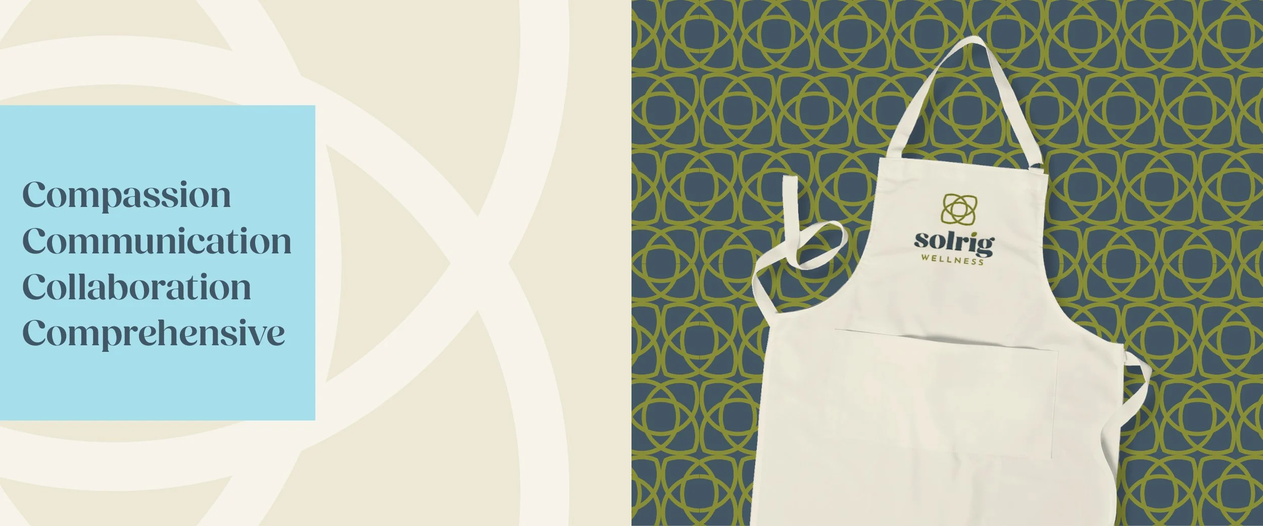
Solrig Wellness provides personalized, systems-based physiological and metabolic consulting for middle-aged adults, as well as teenagers and young adults, empowering them to maximize their resilience and overall wellness. The logo connects to health and healing through the leaf shape and color. The four overlapping leaf shapes correspond to the core values: collaboration, communication, education, and research. The leaf shape is repeated as the tittle of the lowercase letter "i". The typeface for Solrig evokes a calm, friendly, and trusted persona. This logo system allows for flexibility in application while maintaining continuity.
Recognition
2026 Graphis Design Annual | Silver Award